

Table of Contents
- Let’s Install REACT NATIVE (with Expo)
- 1st React Native Application :)))
- # # A Boilerplate Component
- HOW TO USE ICONS in react native
- React Native core components
- Styles
- States
- Custom Component using (( PROPS ))
- Alert, Toast, Notifications
Let’s Install REACT NATIVE (with Expo)
npx create-expo-app --template blankJust do this.
Note: We’re adding –template blank because we don’t want useless files coming to us, making a mess, and confusing us.
npx create-expo-app@latest react-native-app --template blankcd <foldername>
npm run android
“install expo go app from playstore”
npm install -g expo-clinpx expo start
—–scan the app—–
npx expo start –web
npx expo install react-native-web react-dom @expo/metro-runtime1st React Native Application :)))
just do it like normally
import { StatusBar } from 'expo-status-bar';

import { View, Text } from 'react-native'

export default function App ( ) {

return (

< >

<View> <Text> Hello World </Text> </View>

</ >

 )

}
# # A Boilerplate Component
import { StyleSheet, Text, View } from 'react-native';

export default function ANYNAME() {

  return (

< >

<View style={styles.container}>

<Text style= {{ color:'black', fontSize:'18px' }}> Heyyy… </Text>

</View>

</ >

  );

}

const styles = StyleSheet.create({

  container: {

    flex: 1,

    flexWrap: 'wrap',

    alignItems: 'center',

    justifyContent: 'start',

  },

});
HOW TO USE ICONS in react native
https://oblador.github.io/react-native-vector-icons
import Icon from ‘react-native-vector-icons/MaterialIcons’
<Icon name=”star” size={30} color=”gold” />
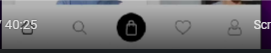
npm install react-native-vector-icons
React Native core components
1. View
View in React Native is like Div in React.
<View>
</View>
import {Text} from 'react-native'

<View style= { { backgroundColor:'red', width:'350px', height:'350px'  } } >

  <View      />

  <View      />

</View>
2. Text
We can’t normally write text in RN, we have to use <Text>…….</Text>
<Text>
</Text>
import {Text} from 'react-native'

<Text style= { { fontSize: '40px' } } >

This is the most amazing thing you learned today.

</Text>
3.TextInput for SearchBox
<TextInput>
</TextInput>
import { TextInput } from 'react-native'

      < TextInput

        style={styles.input}

        placeholder="Enter something"

autoCorrect = {true}

      />
4. Image
<Image source= { ./public/hey.png } />
import {Image} from 'react-native'

<Image source={ ./../public/hey.png } style= { { width:100, height:'400px' } } />

// source={require('./assets/localImage.png')}

// source={{ uri: 'https://example.com/remoteImage.jpg' }}
5. ImageBackground
import {ImageBackground, StyleSheet} from 'react-native'

<ImageBackground source= { { uri: 'https://example.com/background-image.jpg' } } style={styles.background} />

const styles = StyleSheet.create({

  background: {

    flex: 1,

    justifyContent: 'center',

    alignItems: 'center',

  }

})
6. Button
<Button>
</Button>
1. Using Button Component
The built-in Button component is simple and easy to use:
Button doesn’t accept style prop (like: style={{width:’300px’, height:’100px’}})
so you will need to use other options like touchable opacity, ..
Here, what you can do is; use with view, your button will look the same
import { Button, View } from 'react-native';

<View style={{width:"300px", height:"100px"}}>

    <Button title='Click'

onPress= { ()=> alert('button was clicked') }

/>

</View>
2. Using TouchableOpacity ( # )
For high customization than simple button, use TouchableOpacity:
import { TouchableOpacity } from 'react-native';

<TouchableOpacity

        onPress={() => alert('Button pressed')}

        style={{width:200, height:30, color:'white', backgroundColor:'red', borderRadius:'25px', textAlign:'center', position: 'absolute', top:4, right:0, justifyContent:'center' }}

      >Heyy</TouchableOpacity>
3. Using TouchableHighlight
TouchableHighlight is another option, useful for providing feedback when a user touches the button:
import { TouchableHighlight, Text, View, StyleSheet } from 'react-native';

      <TouchableHighlight

        style={styles.button}

        onPress={() => alert('Button pressed')}

        underlayColor="#DDDDDD"

      >

        <Text style={styles.buttonText}>Press me</Text>

      </TouchableHighlight>
4. Using Pressable
The Pressable component offers more flexibility and is useful for custom interactions:
import { Pressable, Text, View, StyleSheet } from 'react-native';

      <Pressable

        style={({ pressed }) => [

          styles.button,

          { backgroundColor: pressed ? '#DDDDDD' : '#008CBA' }

        ]}

        onPress={() => alert('Button pressed')}

      >

        <Text style={styles.buttonText}>Press me</Text>

      </Pressable>
5. Using a Custom Component
Create a custom component and use it everywhere you need button.
import React from 'react';

import { View, Text, StyleSheet, TouchableOpacity } from 'react-native';

const CustomButton = ({ title, onPress }) => (

  <TouchableOpacity style={styles.button} onPress={onPress}>

    <Text style={styles.buttonText}>{title}</Text>

  </TouchableOpacity>

);

const App = () => {

  return (

    <View style={styles.container}>

      <CustomButton title="Press me" onPress={() => alert('Button pressed')} />

    </View>

  );

};

const styles = StyleSheet.create({

  container: {

    flex: 1,

    justifyContent: 'center',

    alignItems: 'center',

  },

  button: {

    backgroundColor: '#008CBA',

    padding: 10,

    borderRadius: 5,

  },

  buttonT    ext: {

    color: '#fff',

    fontSize: 16,

  },

});

export default App;
7. Lists
1. FlatList
only renders items that are currently visible.
Use Case: Best for simple lists where all items are part of a single list.
This is the most popular and widely used list component. It is highly optimized for performance and is suitable for rendering large lists with many items. It supports features like item separators, pull-to-refresh, and infinite scrolling.
import { FlatList, Text, View } from 'react-native';

const data = ['Item 1', 'Item 2', 'Item 3'];

const MyFlatList = () => (

  <FlatList

    data={data}

    renderItem={({ item }) => (

      <View>

        <Text>{item}</Text>

      </View>

    )}

    keyExtractor={(item) => item}

  />

);
1. Vertical and Horizontal Scrolling:
2. pull-to-refresh functionality
3. Pagination:
4. infinite scroll
2. SectionList
renders a list of items divided into sections, each with its own header and optionally a footer
Use Case: Ideal for lists that need to be divided into sections with headers and footers for each section.
How to make anything Scrollable?
import { ScrollView } from 'react-native'

 <ScrollView>

<View style={styles.container}>

    <Catii text='Laptop' url='https://m.media-amazon.com/images/I/71p-M3sPhhL.jpg' />

</View>

</ScrollView>
to make it horizontal
< ScrollView horizontal = { true }
showsHorizontalScrollIndicator={false}Styles
mport { StyleSheet } from 'react-native'

style= { styles.hello }

after export

const styles = StyleSheet.create ( {

hello:{

color : 'red',

fontSize : '35px'

}

     } )
Normal Styles
This is your inline style.
import { StatusBar } from 'expo-status-bar'

import { View, Text } from 'react-native'

export default function App ( ) {

return(

< >

<View> <Text style= { { color : 'red', fontSize: '35px' } }> Hello World </Text> </ View>

</ >

  )

}
StyleSheet Styles
you can use inline style too, but this will make your code harder to read.
so, its easier to use stylesheet.
import { StatusBar } from 'expo-status-bar'

import { StyleSheet, View, Text } from 'react-native'

export default function App ( ) {

return(

< >

<View> <Text style= { styles.hello } > Hello World </Text> </ View>

</ >

  )

}

const styles = StyleSheet.create ( {

hello:{

color : 'red',

fontSize : '35px'

}

     } )
States
Difference between state & variable
state is a better way because it updates ui everytime when the state variable is changed.
incase of only variable, when they are changed, they do not update the ui.
import 'ExpoStatusBar' from 'react-native-expo'

import { View, Text } from 'react-native'

import React, { useState } from 'react'

export default function App( ) {

const [name, setState] = useState ('Ram')

function PressHandler ( ) {

setState('The state was updated')

}

return (

< >

<View>

<Text> {name} </ Text>

<Button title='Click' onPress= {PressHandler} />

</View>

</ >

  )

}
Custom Component using (( PROPS ))
How was it at previous time? <Icon name=”home” size={40} color=’white’/>
import Icon from 'react-native-vector-icons/MaterialIcons'

function Iconi(props){

  return(

  <Icon name={props.iconName} size={40} color='white'/>

  )

}

export default function App() {

  return (

< >

              <Iconi iconName='home'/>

   </ >

   );

}
Problem to load complex props?
use this
onPress={props.onPress}and then use this
onPress={() => navigation.navigate('Home')}

 [ in React vs NextJS ]")

